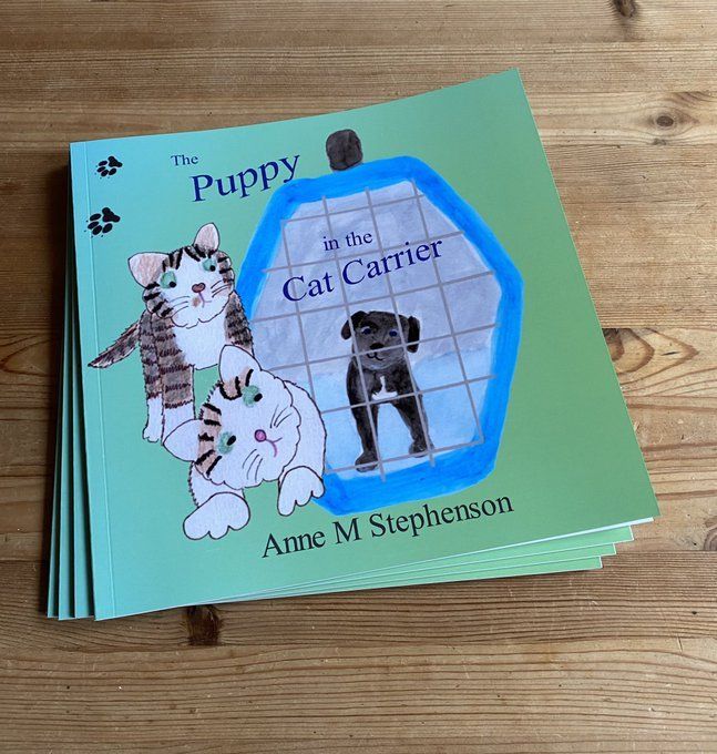
Never judge a book by its cover they say, but the cover is the one standing tall for all to see.
Never judge a book by its cover…?
Never judge a book by its cover they say, but the cover is the one standing tall for all to see. It’s the representative of all the characters held within, displaying just enough to entice someone to reach out to the book and take the next step. It’s a huge responsibility and it’s a wonder more covers don’t get stage fright and launch themselves off shelves, opening up to let their contents escape and tell their own stories…
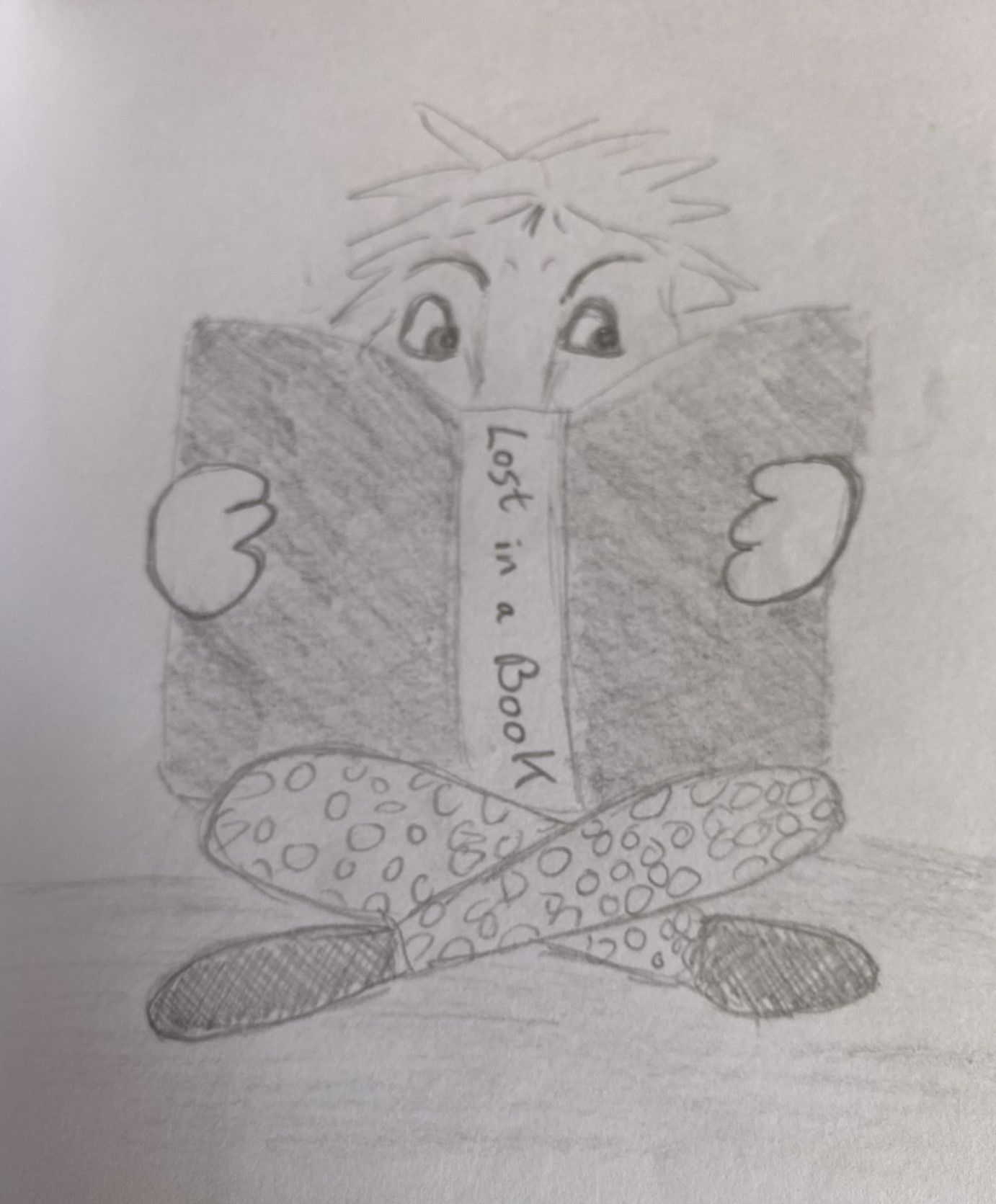
So what should go on the cover? Well the title obviously, strangely I’ve never heard of anyone saying don’t judge a book by its title… and yet that is probably a similar concept. A title may be straight to the point and state what the book is about, or it may be a little more elusive, aiming to entice, not reveal.
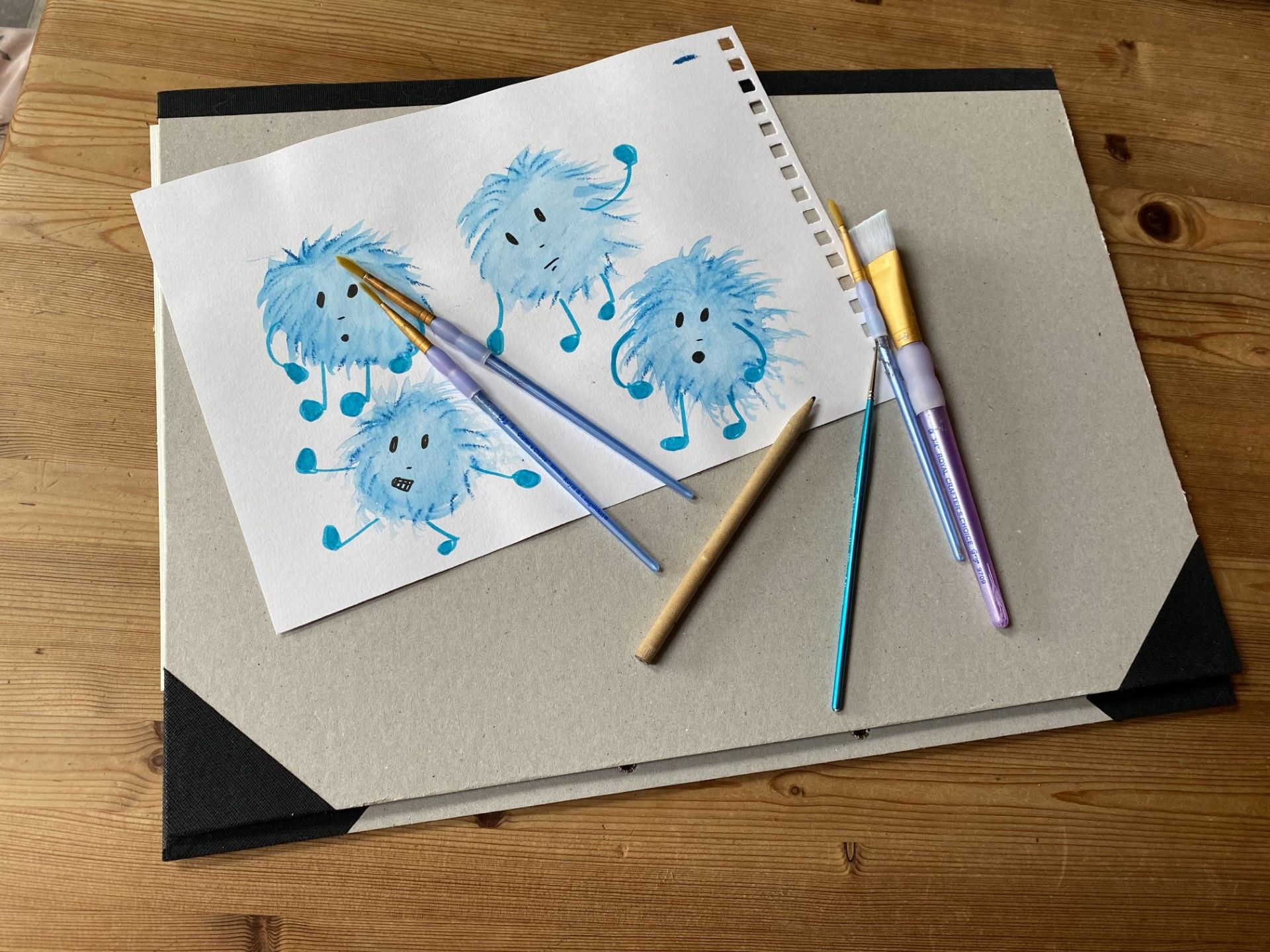
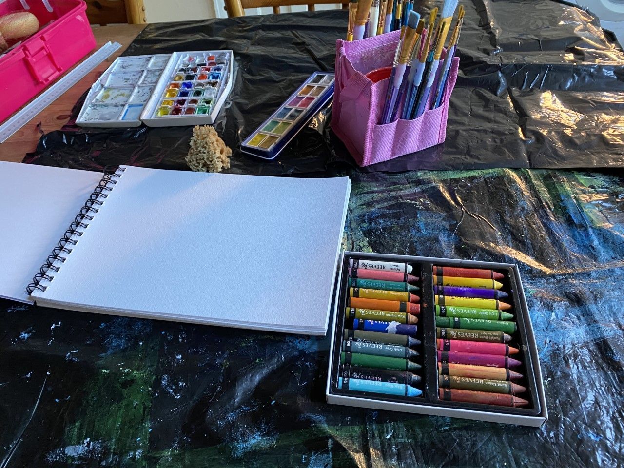
But tastes are very subjective, and there is no clear right or wrong design for a book cover. The words and illustrations need to work together and there’s always a bit of argy-bargee when words and pictures have to work together; should the words wrap around the pictures, or should they be printed over the pictures? If the words are printed over the pictures, there may need to be a bit of shuffling so that important parts of the picture aren’t covered, or words lost in similar colours. But, with a bit of coaxing, words and pictures can be persuaded to work together, until words and pictures and the resulting cover are all shown at their best and ready to face the world as the ambassador for the story and characters within.